USPS Mobile
App Redesign
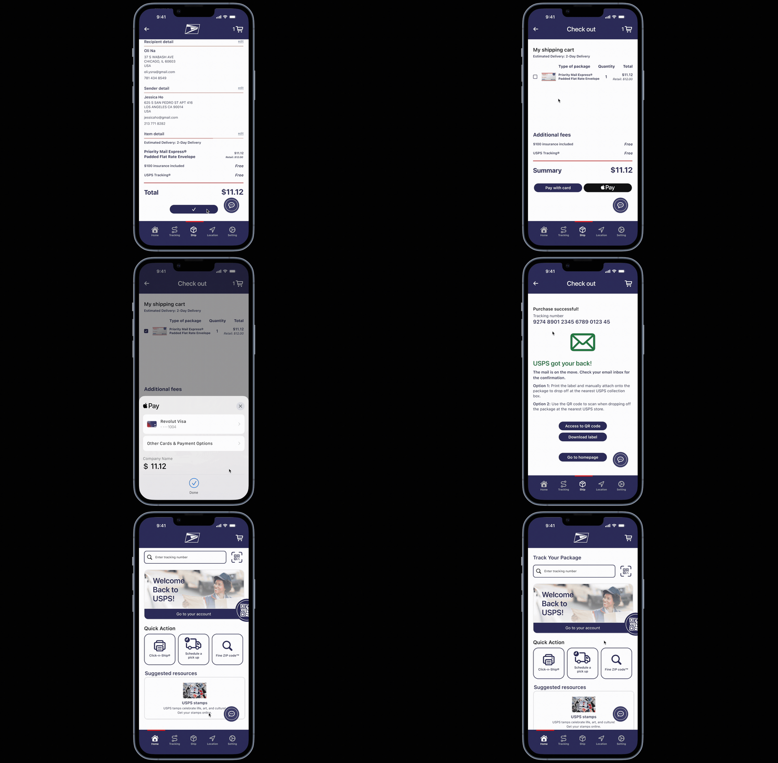
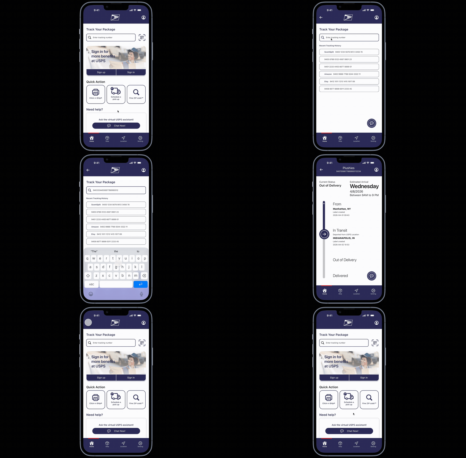
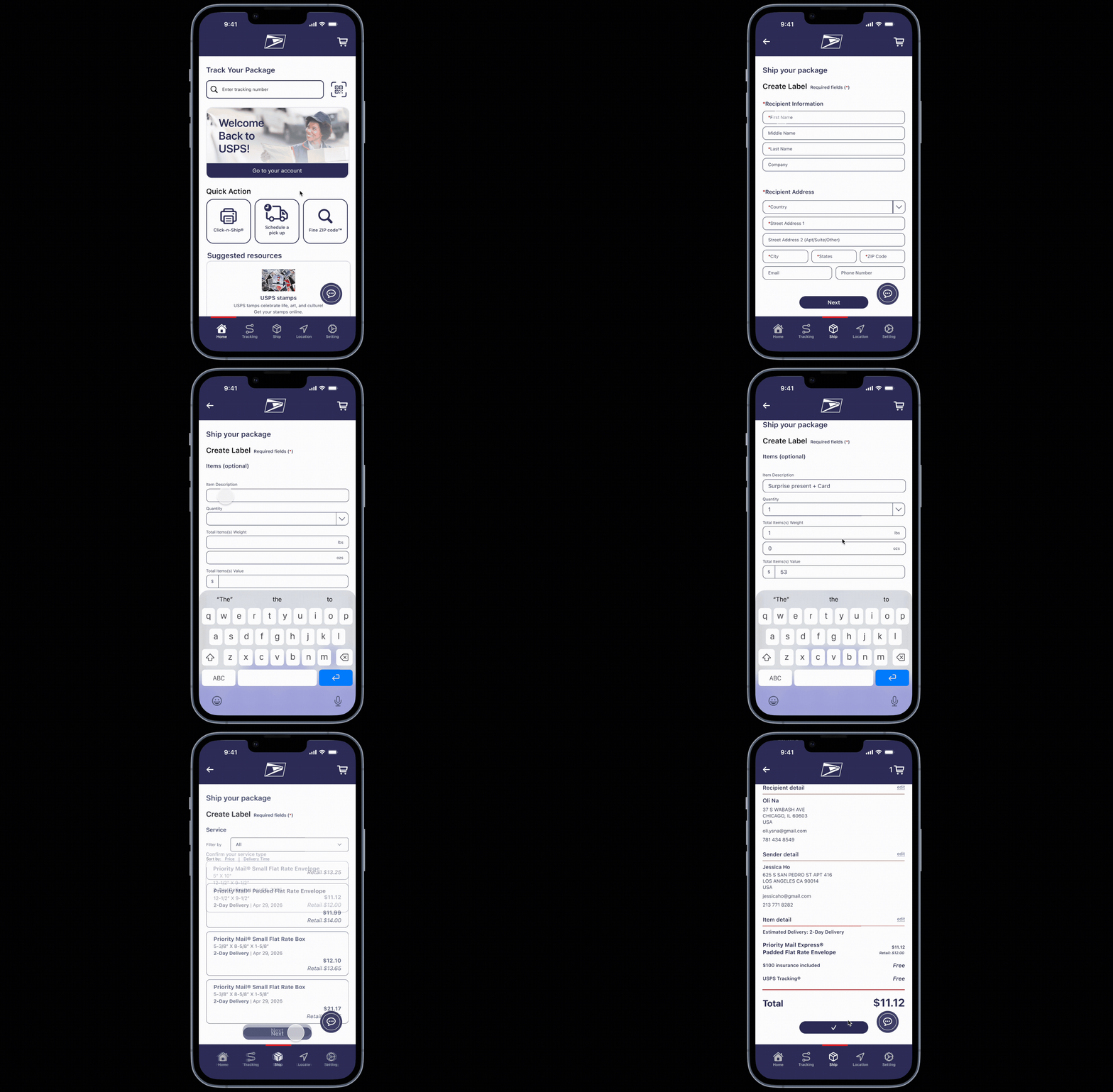
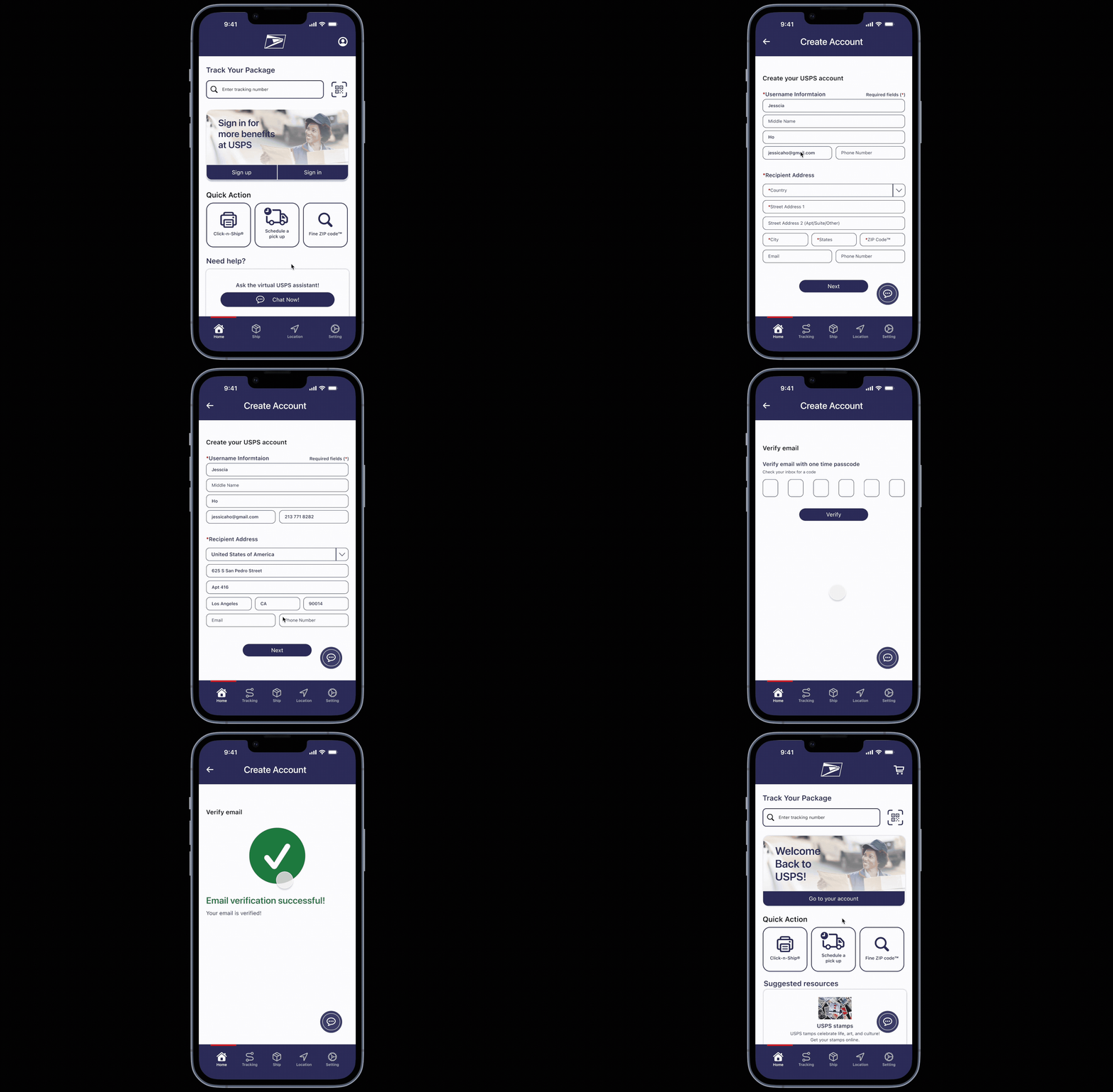
Redesigned the USPS mobile app to make mailing, shipping, and tracking clearer, faster, and easier. Simplified structure and familiar iOS interactions keep tasks in-app for a cleaner, friendlier experience that reduces friction and builds trust.
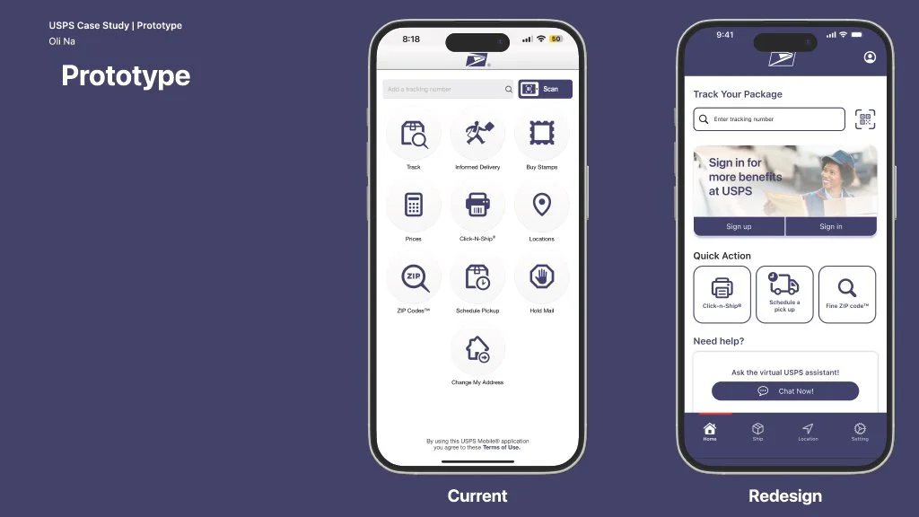
USPS Prototype
Case study slide
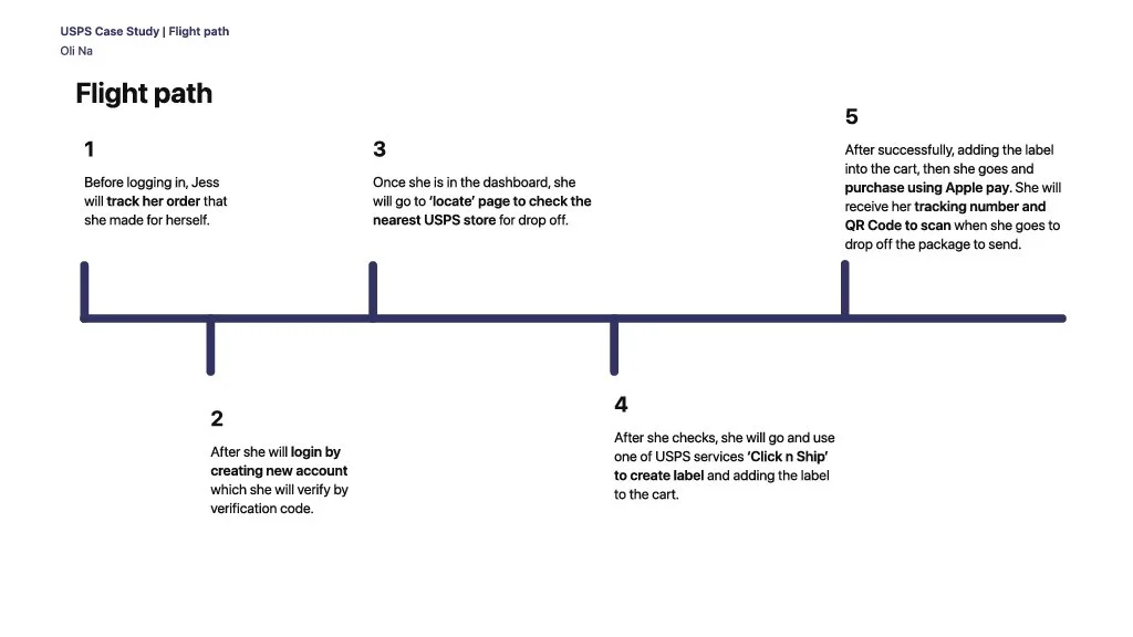
Journey Map
Challenge
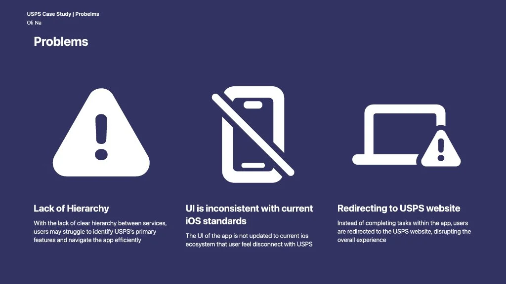
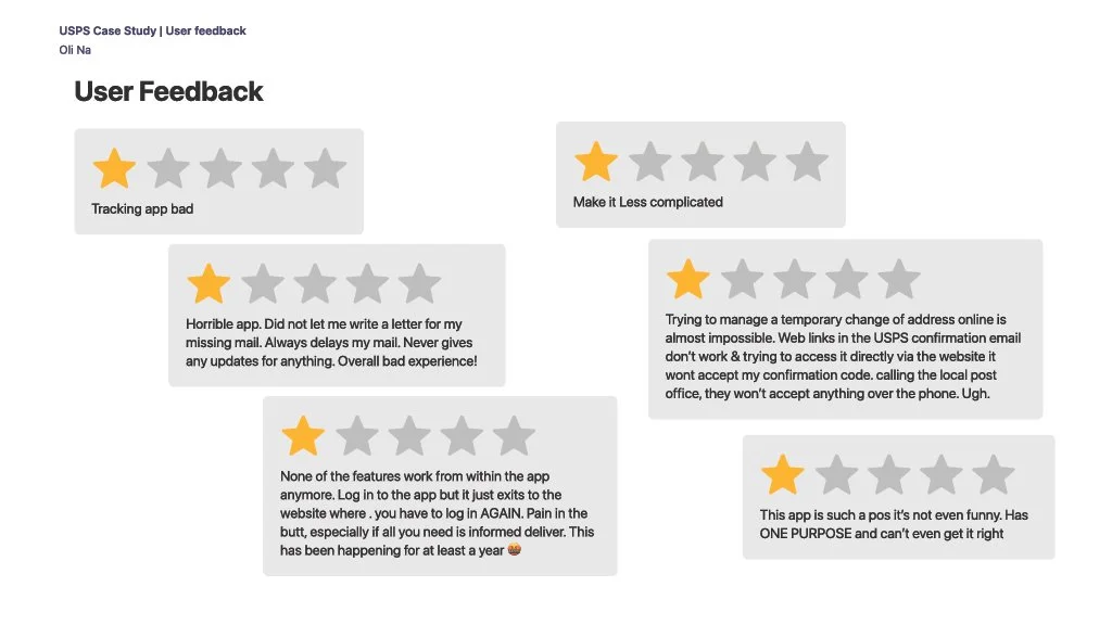
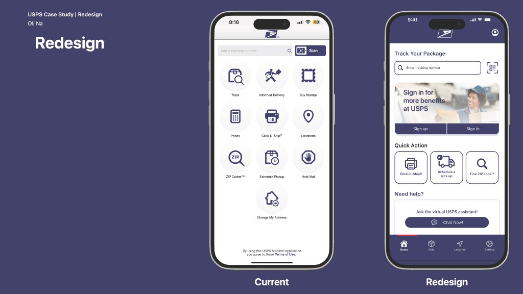
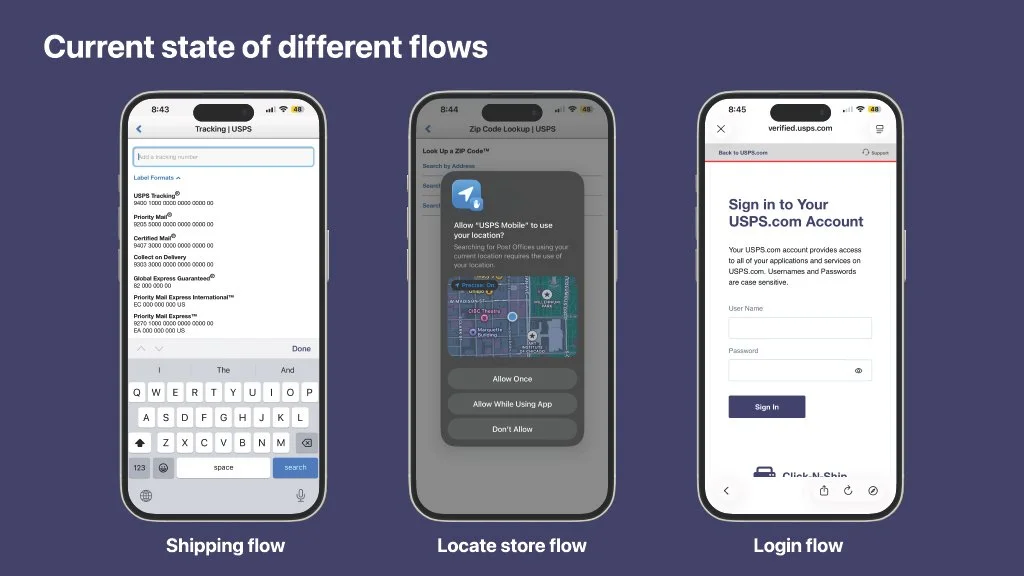
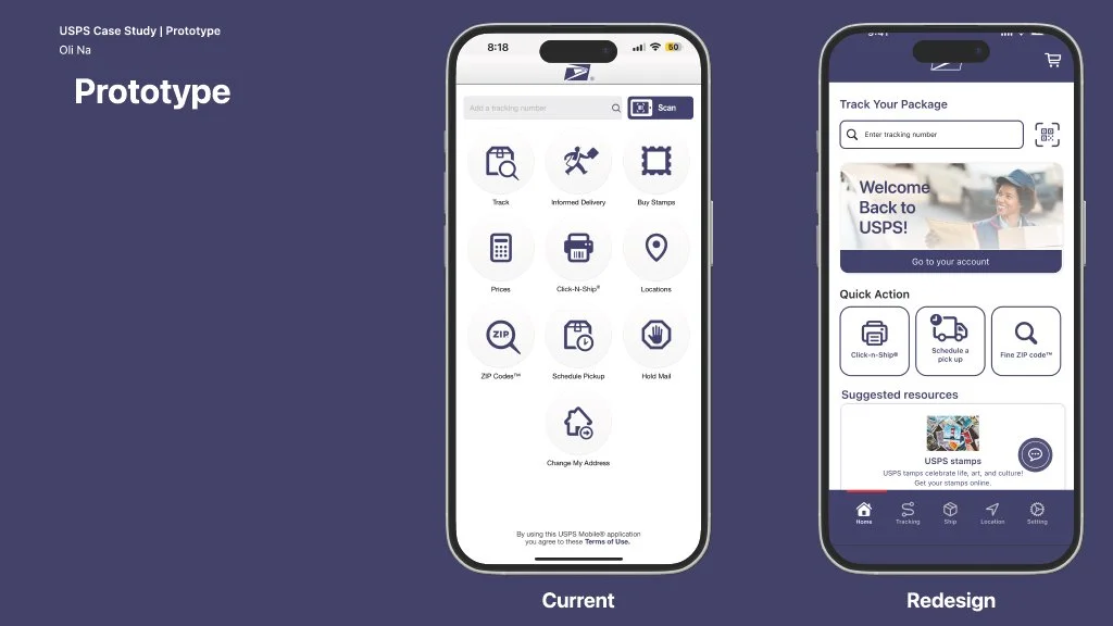
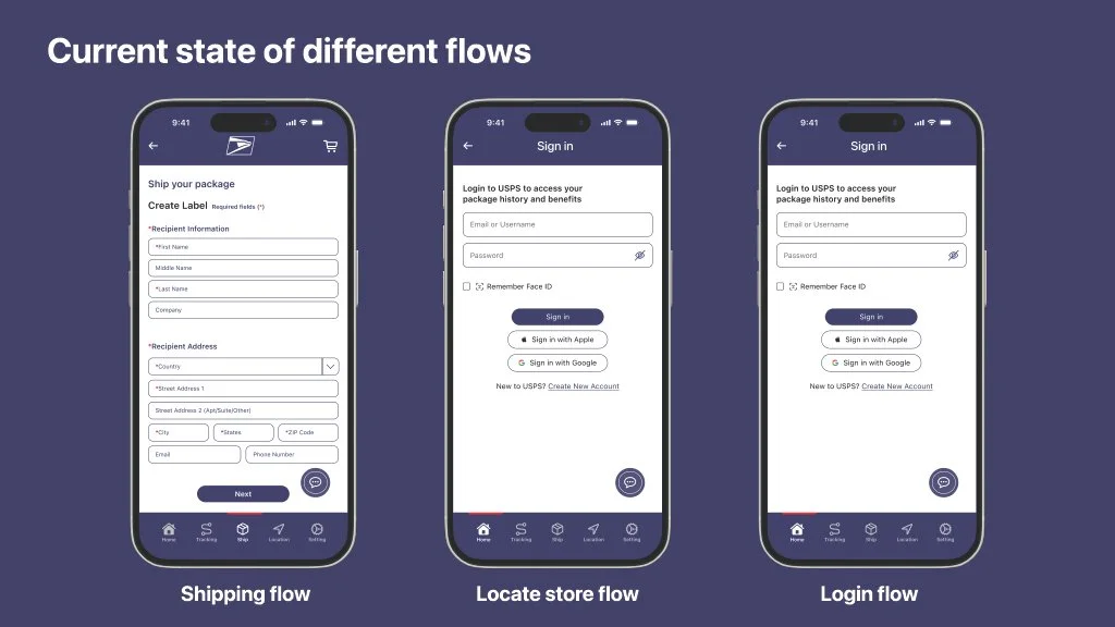
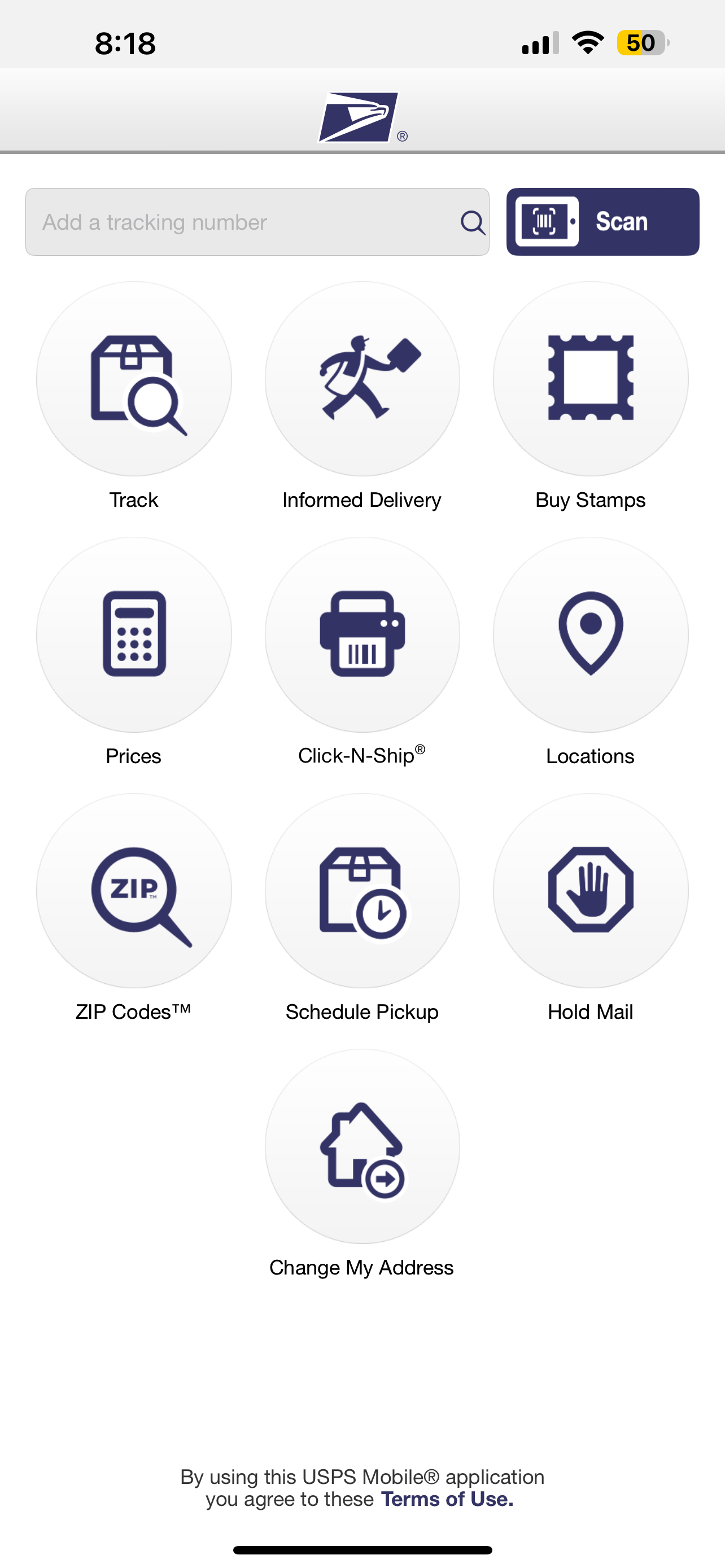
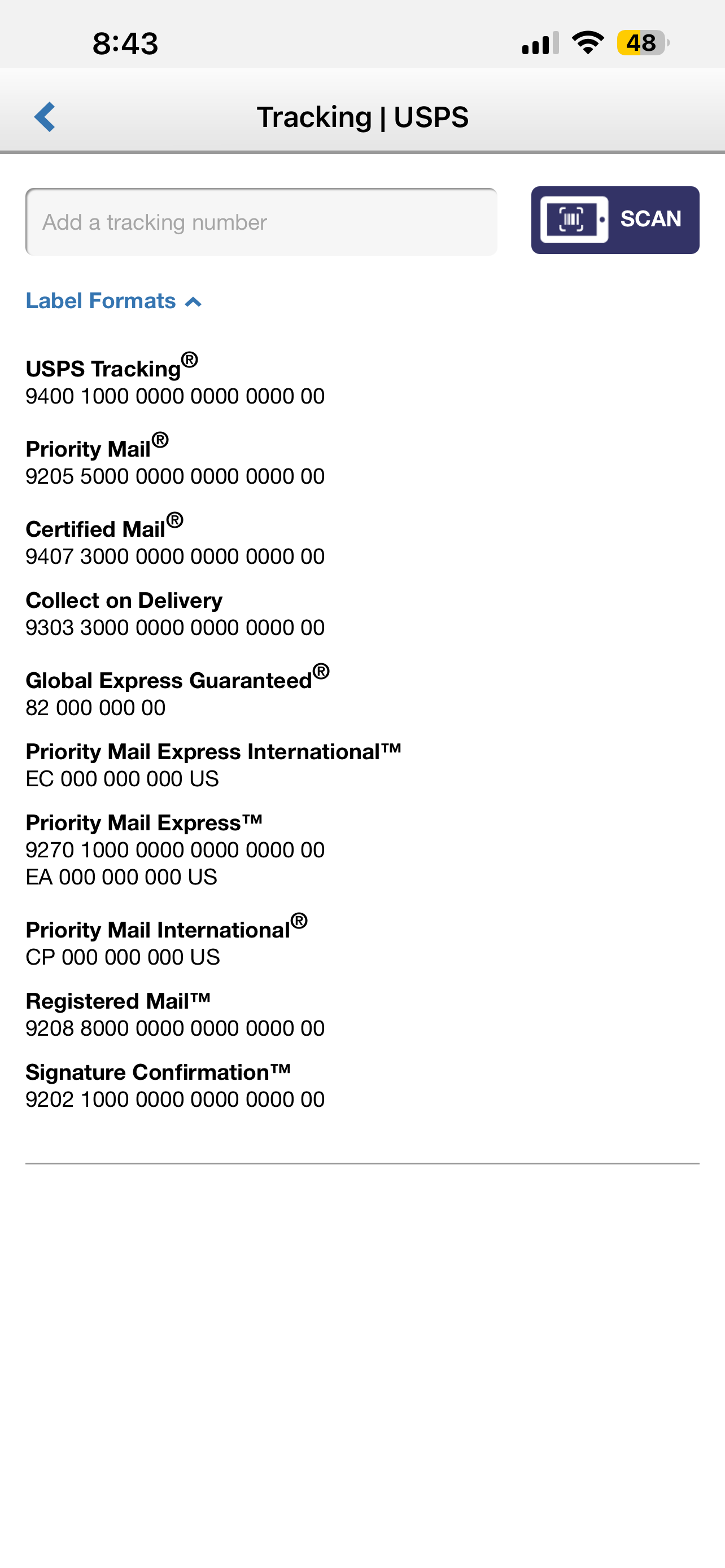
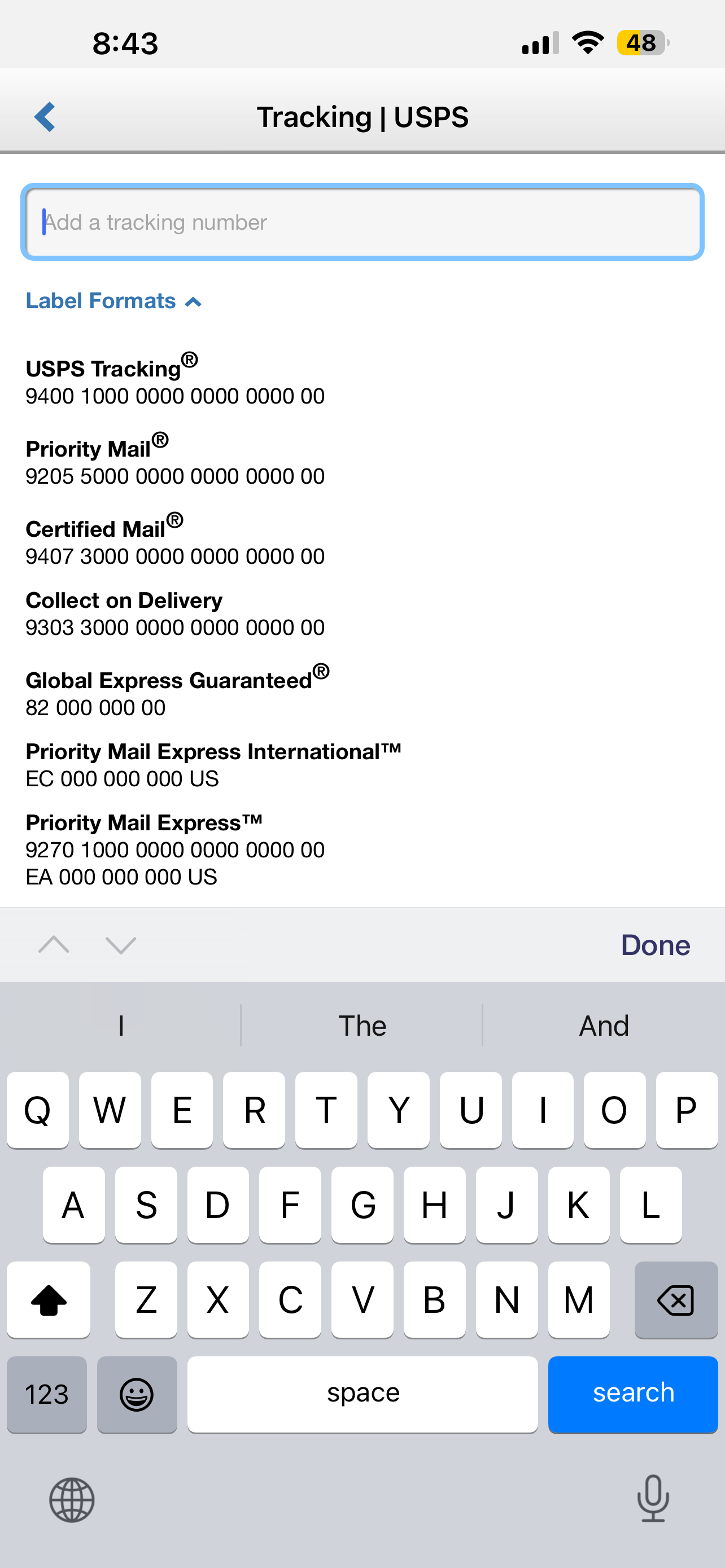
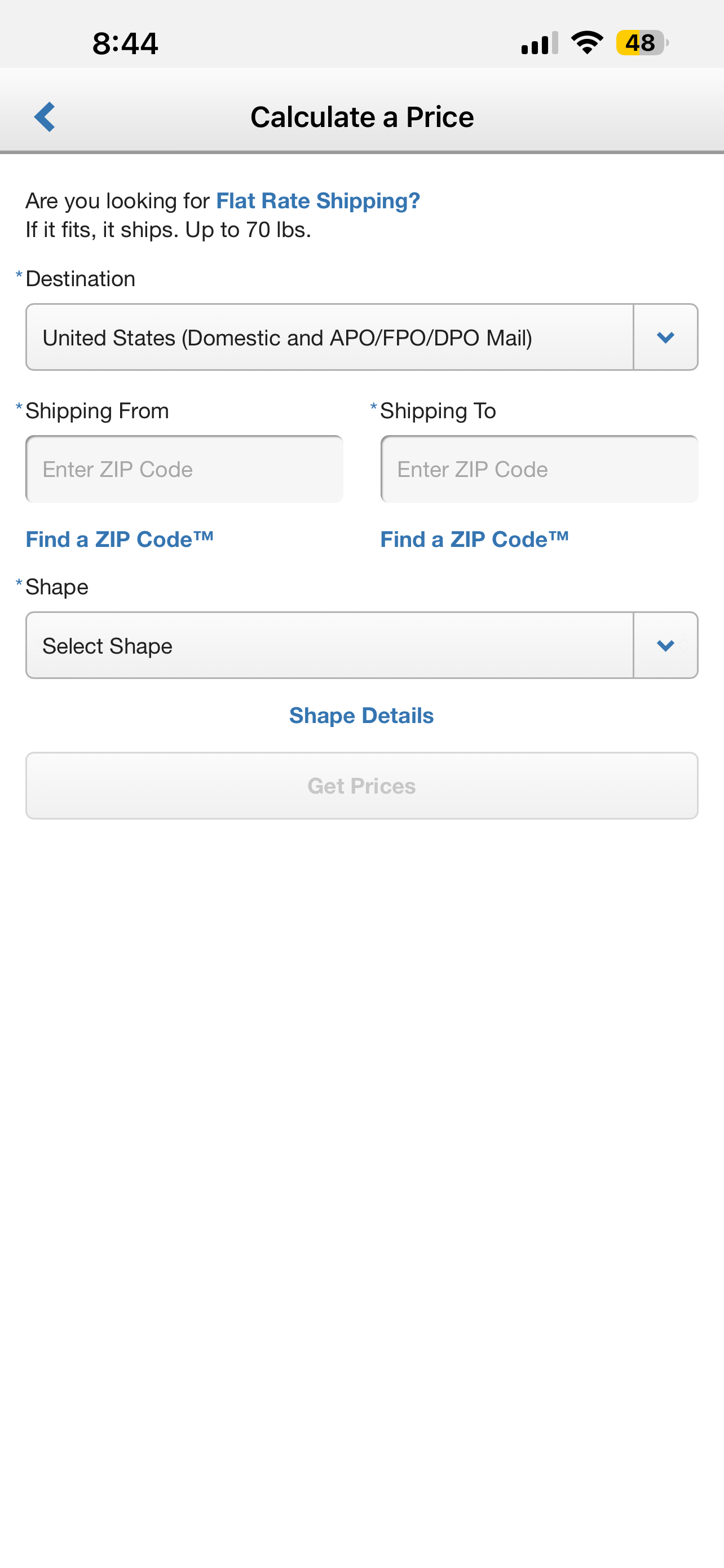
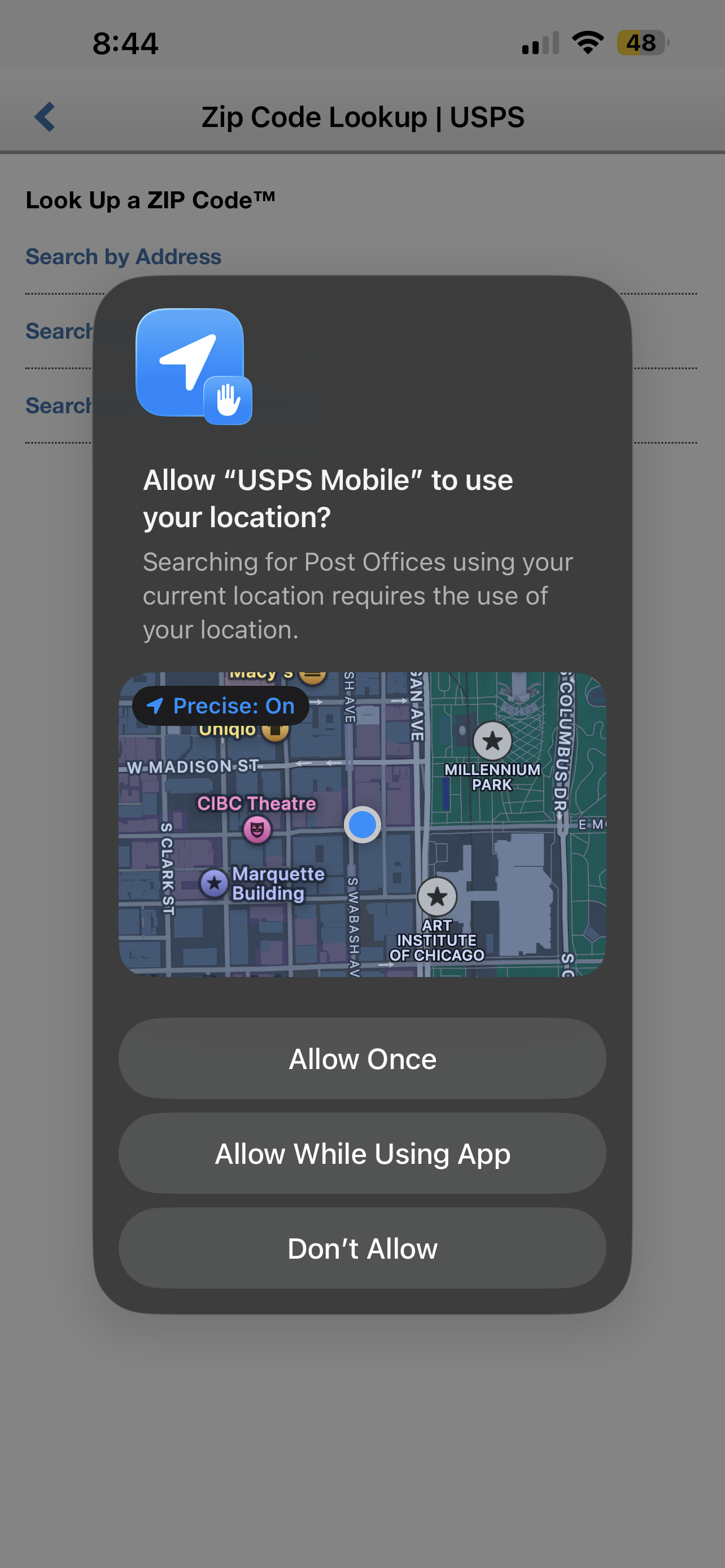
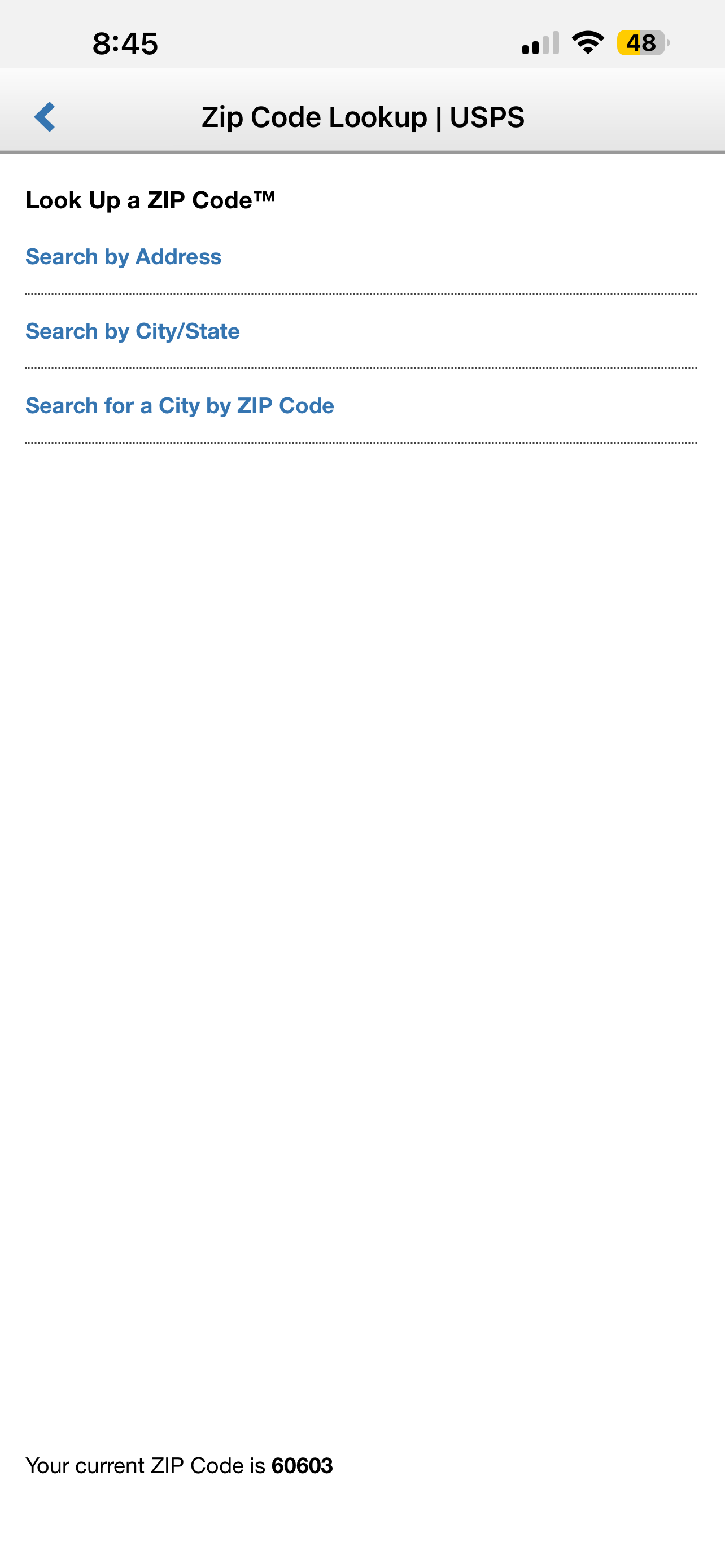
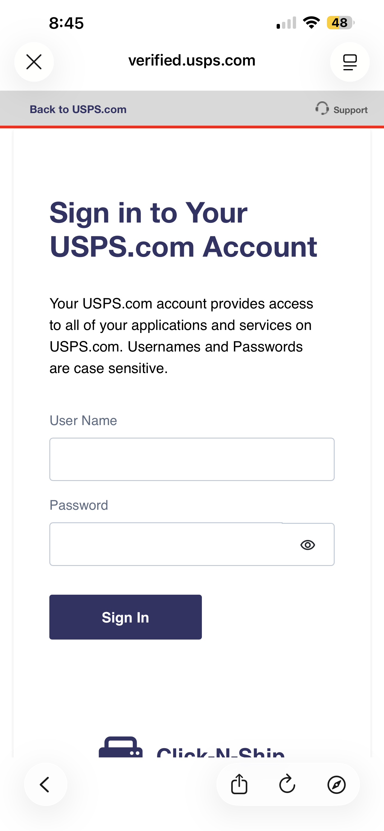
The USPS mobile app experience felt visually cluttered and difficult to navigate, with too many calls to action, unclear hierarchy, and an interface that did not feel fully native to current iOS patterns. Key flows, such as Click-N-Ship, also felt disconnected because users were redirected to a browser to sign in and complete their order.
The challenge was to create a clearer, more intuitive mobile experience where users could complete important tasks, like shipping, tracking, and managing deliveries, fully within the app.
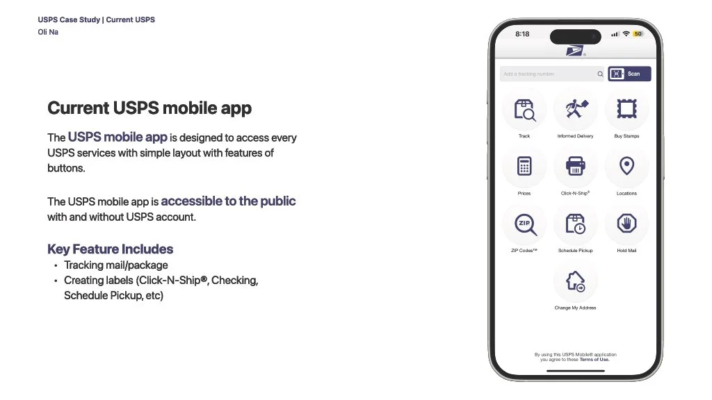
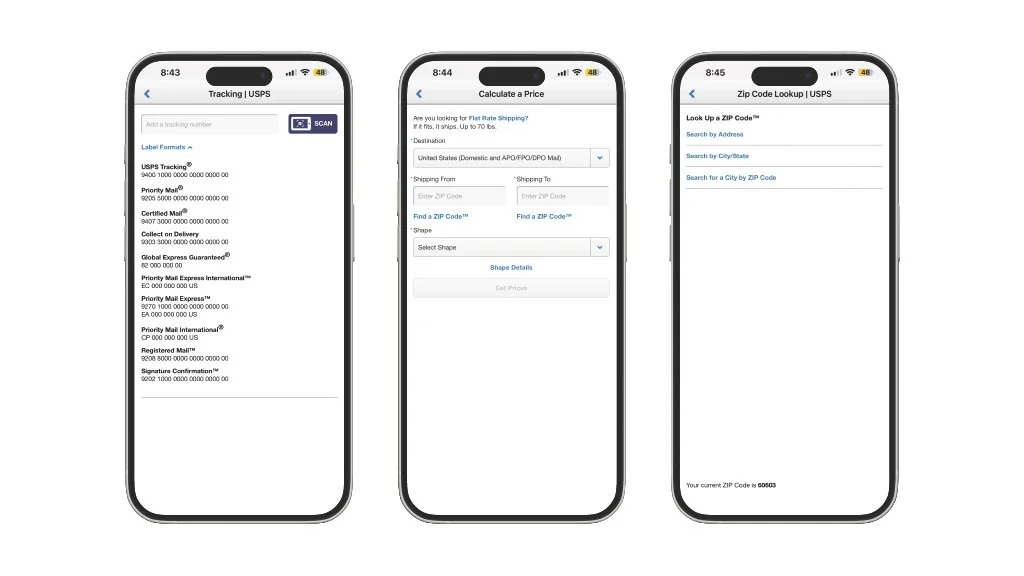
Current USPS mobile app


Approach
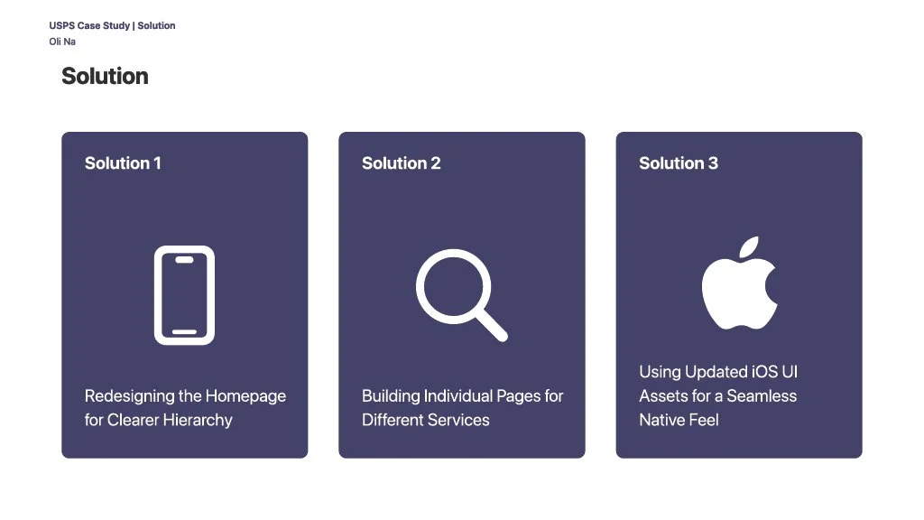
I redesigned the USPS mobile experience to feel more organized, welcoming, and native to iOS. I focused on simplifying the navigation, improving visual hierarchy, and creating a smoother in-app flow so users could start and finish key tasks without being redirected to an outside browser.
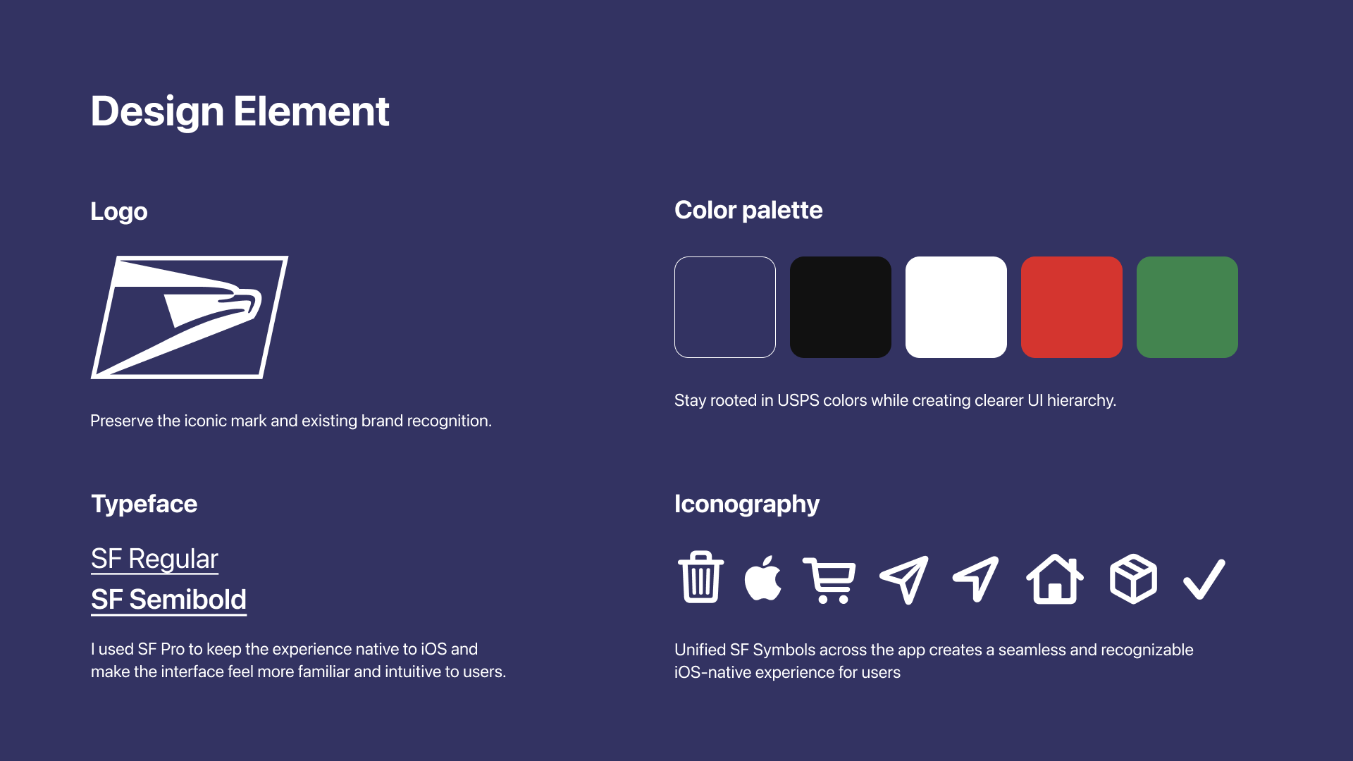
The design also keeps USPS brand familiarity in mind, using a cleaner interface and updated interaction patterns while still feeling recognizable, trustworthy, and easy to use.
User persona
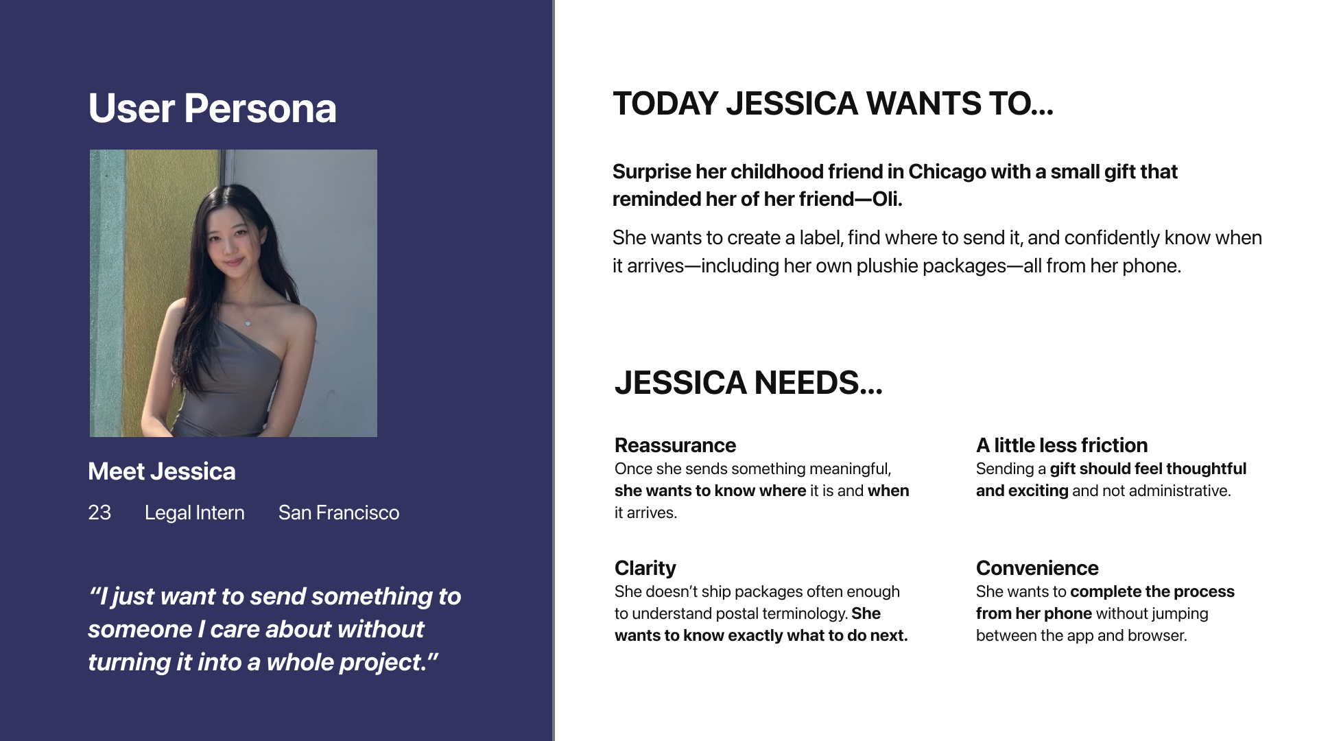
Meet Jessica!
She is…

23 Years old
Legal Intern
and Lives in San Francisco
What does she want to do?
Jessica wants to surprise her childhood friend in Chicago with a small gift!
What does she Need?
She needs a simple, clear, and reassuring experience that lets her create a label, find where to send her package, and track its delivery without jumping between different platforms or navigating confusing postal terminology.
USPS mobile app Design Element
USPS mobile app redesign